|
Größe: 11428
Kommentar:
|
← Revision 15 vom 2015-05-02 18:42:40 ⇥
Größe: 16573
Kommentar:
|
| Gelöschter Text ist auf diese Art markiert. | Hinzugefügter Text ist auf diese Art markiert. |
| Zeile 4: | Zeile 4: |
| Zeile 6: | Zeile 7: |
| Zeile 9: | Zeile 11: |
| }}} == Structure of a ggplot Object == |
data: [x] faceting: facet_null() }}} * what we see are empty place holders * when we use str() to explore the structure of the object we see that it is a list with length 9 |
| Zeile 14: | Zeile 20: |
| List of 9 $ data : list() ..- attr(*, "class")= chr "waiver" $ layers : list() $ scales :Reference class 'Scales' [package "ggplot2"] with 1 fields ..$ scales: NULL ..and 21 methods, of which 9 are possibly relevant: .. add, clone, find, get_scales, has_scale, initialize, input, n, .. non_position_scales $ mapping : list() $ theme : list() $ coordinates:List of 1 ..$ limits:List of 2 .. ..$ x: NULL .. ..$ y: NULL ..- attr(*, "class")= chr [1:2] "cartesian" "coord" $ facet :List of 1 ..$ shrink: logi TRUE ..- attr(*, "class")= chr [1:2] "null" "facet" $ plot_env :<environment: R_GlobalEnv> $ labels : list() - attr(*, "class")= chr [1:2] "gg" "ggplot" |
|
| Zeile 17: | Zeile 45: |
| * the first argument to ggplot is data * then specify what graphics shapes you are going to use to view the data (e.g. geom\_line() or geom\_point()). * specify what features (or aesthetics) will be used (e.g. what variables will determine x- and y-locations) with the aes() function * if these aesthetics are intented to be used in all layers it is more convenient to specify them in the ggplot object |
* the first argument to ggplot is data * then specify what graphics shapes you are going to use to view the data (e.g. geom_line() or geom_point()). * specify what features (or aesthetics) will be used (e.g. what variables will determine x- and y-locations) with the aes() function * if these aesthetics are intented to be used in all layers it is more convenient to specify them in the ggplot object |
| Zeile 22: | Zeile 52: |
| * first we create a little sample data frame\small | * first we create a little sample data frame\small |
| Zeile 41: | Zeile 72: |
| == Feed the Object == * then create a ggplot object containing the data and some standard aesthetics (here we define the x and the y positions) * add one or more geoms, we begin with geom\_point |
* then we create a ggplot object containing the data and some standard aesthetics (here we define the x and the y positions) * add one or more geoms, we begin with geom_point |
| Zeile 49: | Zeile 80: |
| <img alt='sesssion2/ggp1.pdf' src='-1' /> == Layers == * ggplot() creates an object - every "+" adds something to this object (change the object) * the default method of ggplot() is print(), which creates the plot * it is better to store the object - so you can change it (e.g. you can change the data frame) == Layers == * so we add another layer, which adds a label to the points (use geom\_text) {{{#!highlight r }}} * aes(label=l) maps the l variable to the label aesthetic, and hjust and vjust define where our labels are placed <img alt='sesssion2/ggp2.pdf' src='-1' /> == Layers == * imagine you have worked a little time on a plot - and then you detect a mistake in your data, so the ''real'' data frame looks different * so you can replace the old, wrong data by the new data (using \%+\% \footnotesize |
[[attachment:ggp1.pdf]] == Layers == * ggplot() creates an object - every "+" adds something to this object (change the object) * the default method of ggplot() is print(), which creates the plot * it is better to store the object - so you can change it (e.g. you can change the data frame) == Layers == * so we add another layer, which adds a label to the points (use geom_text) {{{#!highlight r > p2 <- po + + geom_point() + + geom_text(aes(label=l), hjust=1.1, vjust=-0.2) > p2 }}} * aes(label=l) maps the l variable to the label aesthetic, and hjust and vjust define where our labels are placed [[ggp2.pdf]] == Layers == * imagine you have worked a little time on a plot - and then you detect a mistake in your data, so the ''real'' data frame looks different * so you can replace the old, wrong data by the new data (using %+%) |
| Zeile 81: | Zeile 122: |
| <img alt='sesssion2/ggp3.pdf' src='-1' /> | [[attachment:ggp3.pdf]] |
| Zeile 86: | Zeile 128: |
| <img alt='sesssion2/ggp3.pdf' src='-1' /> == Layers == * by using the line geom you can join the points (we use the new data) |
== Layers == * by using the line geom you can join the points (we use the new data) |
| Zeile 93: | Zeile 135: |
| <img alt='sesssion2/ggp4.pdf' src='-1' /> == Layers == * you can also join the points in the order of the data fram by using the path geom instead\footnotesize {{{#!highlight r > my.text <- geom_text(aes(label=l), + hjust=1.1, |
[[attachment:ggp4.pdf]] == Layers == * you can also join the points in the order of the data fram by using the path geom instead\footnotesize {{{#!highlight r > my.text <- geom_text(aes(label=l), + hjust=1.1, |
| Zeile 102: | Zeile 146: |
| <img alt='sesssion2/ggp5.pdf' src='-1' /> | [[attachment:ggp5.pdf]] |
| Zeile 105: | Zeile 150: |
| * there are three geoms: abline, vline, hline * abline adds one or more lines with specified slope and intercept to the plot\footnotesize |
* there are three geoms: abline, vline, hline * abline adds one or more lines with specified slope and intercept to the plot\footnotesize |
| Zeile 117: | Zeile 164: |
| <img alt='sesssion2/ggp6.png' src='-1' /> == Layers == * adding lines referring to the data frame |
[[attachment:ggp6.png|{{attachment:ggp6.png||width=800}}]] == Layers == * adding lines referring to the data frame |
| Zeile 122: | Zeile 173: |
| + geom_abline(aes(slope=b,intercept=a,colour=x1)) + + scale_x_continuous(limits=c(0,10)) }}} <img alt='sesssion2/ggp7.pdf' src='-1' /> == Layers == * the same works for the hline and the vline geom which add horizonal and vertical line(s) * argument: yintercept, xintercept respectively * setting and mapping are possible |
+ geom_abline(aes(slope=b,intercept=a,colour=x1)) + + scale_x_continuous(limits=c(0,10)) }}} [[attachment:ggp7.pdf]] == Layers == * the same works for the hline and the vline geom which add horizonal and vertical line(s) * argument: yintercept, xintercept respectively * setting and mapping are possible |
| Zeile 132: | Zeile 185: |
| > p1 + geom_hline(yintercept=1:10) + | > p1 + geom_hline(yintercept=1:10) + |
| Zeile 135: | Zeile 188: |
| <img alt='sesssion2/ggp8.pdf' src='-1' /> | [[attachment:ggp8.pdf]] |
| Zeile 137: | Zeile 191: |
| * some other layers for 1 continuous variable: * geom\_boxplot() * geom\_histogram() * geom\_density() * some other layers for 1 discrete variable: * geom\_bar() * some other layers for 2 or more continuous variables: * geom\_smooth() * geom\_density2d() * geom\_contour() * geom\_quantile() |
* some other layers for 1 continuous variable: * geom_boxplot() * geom_histogram() * geom_density() * some other layers for 1 discrete variable: * geom_bar() * some other layers for 2 or more continuous variables: * geom_smooth() * geom_density2d() * geom_contour() * geom_quantile() |
| Zeile 149: | Zeile 204: |
| * use our data frame or load it: \texttt{load("20150310data.rdata")} * create a new variable EC1 containing the first 2 letters of the Event.Code column, use the function str\_sub() from the stringr package (type \texttt{?str\_sub} to get help) == Exercises == |
* use our data frame or load it: load("20150310data.rdata") * create a new variable EC1 containing the first 2 letters of the Event.Code column, use the function str_sub() from the stringr package (type ?str_sub to get help) === Solutions === |
| Zeile 177: | Zeile 233: |
| == Exercises == Create the five plots and save them into a file. * create a plot using ggplot, map the variable EC1 to x and use geom\_bar() * now to the plot again, but add another aesthetic: fill (colour of the filling); map fill to Stim.Type * add the position argument to geom\_bar(), set it to "fill" * now add \texttt{facet\_wrap(~testid)} to show the same graph per time * make a graph facetted per child showing stacked hit/incorrect bars with time on the x axis == Exercises == * create a plot using ggplot, map the variable EC1 to x and use geom\_bar() |
== Exercises II == Create the five plots and save them into a file. * create a plot using ggplot, map the variable EC1 to x and use geom_bar() * now to the plot again, but add another aesthetic: fill (colour of the filling); map fill to Stim.Type * add the position argument to geom_bar(), set it to "fill" * now add facet_wrap(~testid) to show the same graph per time * make a graph facetted per child showing stacked hit/incorrect bars with time on the x axis === solutions === * create a plot using ggplot, map the variable EC1 to x and use geom_bar() |
| Zeile 189: | Zeile 247: |
| > | > |
| Zeile 191: | Zeile 249: |
| Saving 16 x 9.13 in image }}} <img alt='sesssion2/plot1.png' src='-1' /> == Exercises == * now to the plot again, but add another aesthetic: fill (colour of the filling); map fill to Stim.Type |
Saving 16 x 9.13 in image }}} [[attachment:plot1.png|{{attachment:plot1.png||width=800}}]] * now to the plot again, but add another aesthetic: fill (colour of the filling); map fill to Stim.Type |
| Zeile 199: | Zeile 260: |
| > | > |
| Zeile 203: | Zeile 264: |
| <img alt='sesssion2/plot2.png' src='-1' /> == Exercises == * add the position argument to geom\_bar(), set it to "fill" |
[[attachment:plot1.png|{{attachment:plot2.png||width=800}}]] * add the position argument to geom_bar(), set it to "fill" |
| Zeile 209: | Zeile 272: |
| > | > |
| Zeile 213: | Zeile 276: |
| <img alt='sesssion2/plot3.png' src='-1' /> == Exercises == * now add \texttt{facet\_wrap(~testid)} to show the same graph per time |
[[attachment:plot3.png|{{attachment:plot3.png||width=800}}]] * now add facet_wrap(~testid) to show the same graph per time |
| Zeile 220: | Zeile 285: |
| > | > |
| Zeile 224: | Zeile 289: |
| <img alt='sesssion2/plot4.png' src='-1' /> == Exercises == * now add \texttt{facet\_wrap(~testid)} to show the same graph per time |
[[attachment:plot4.png|{{attachment:plot4.png||width=800}}]] * now add facet_wrap(~testid) to show the same graph per time |
| Zeile 231: | Zeile 298: |
| > | > |
| Zeile 235: | Zeile 302: |
| <img alt='sesssion2/plot4a.png' src='-1' /> == Exercises == * make a graph facetted per child showing stacked hit/incorrect bars with time on the x axis |
[[attachment:plot4a.png|{{attachment:plot4a.png||width=800}}]] * make a graph facetted per child showing stacked hit/incorrect bars with time on the x axis |
| Zeile 245: | Zeile 315: |
| <img alt='sesssion2/plot5.png' src='-1' /> == Introduction == The dplyr package makes each of these steps as fast and easy as possible by: * Elucidating the most common data manipulation operations, so that your options are helpfully constrained when thinking about how to tackle a problem. * Providing simple functions that correspond to the most common data manipulation verbs, so that you can easily translate your thoughts into code. * Using efficient data storage backends, so that you spend as little time waiting for the computer as possible. |
[[attachment:plot5.png|{{attachment:plot5.png||width=800}}]] |
| Zeile 253: | Zeile 320: |
| * this leads to another important type of component not yet mentioned * if you map a variable to a aesthetic is these done in a default way, in this case some reddish colour is mapped to hit while light blue is mapped to incorrect; in addition a discrete range of colours is automatically used * these rules of mapping are called scales * different type of scales exists for the axes, colours, shapes etc, some of them exists in discrete and continuous versions, some in just one of them (in general one can say, everytime there can be a legend there is a scale) * the name convention: scale\_aesthetic\_specification. for example scale\_x\_discrete for customizing a discrete x axis (e.g. in barplots) |
* this leads to another important type of component not yet mentioned * if you map a variable to a aesthetic is these done in a default way, in this case some reddish colour is mapped to hit while light blue is mapped to incorrect; in addition a discrete range of colours is automatically used * these rules of mapping are called scales * different type of scales exists for the axes, colours, shapes etc, some of them exists in discrete and continuous versions, some in just one of them (in general one can say, everytime there can be a legend there is a scale) * the name convention: scale_aesthetic_specification. for example scale_x_discrete for customizing a discrete x axis (e.g. in barplots) |
| Zeile 259: | Zeile 328: |
| * to change our discrete colour scale for the filling we type \footnotesize | * to change our discrete colour scale for the filling we type \footnotesize |
| Zeile 266: | Zeile 336: |
| <img alt='sesssion2/ggp10.png' src='-1' /> == Changing a Scale == |
[[attachment:ggp10.png|{{attachment:ggp10.png||width=800}}]] |
| Zeile 269: | Zeile 340: |
| * scale\_colour\_grey() * scale\_colour\_hue() * scale\_colour\_brewer() == Changing a Scale == |
* scale_colour_grey() * scale_colour_hue() * scale_colour_brewer() |
| Zeile 287: | Zeile 359: |
== Continuous Scales == Not only colour scales are modifiable * here scale_aesthetic_specification becomes scale_x_continuous() or scale_y_continuous() * to transform a axis we can use the trans arg * we now create a scatter plot with Trial on the x-axis and TTime on the y-axis * the respective geom is geom_point() * if we look at the distribution of the y values we see that they are right skewed {{{#!highlight r > ggplot(data,aes(x=Trial,y=TTime)) + + geom_point() > ggsave("ggp11.png") }}} [[attachment:ggp11.png|{{attachment:ggp11.png||width=800}}]] * to face the skewness we can transform the y-axis maybe with a square root function {{{#!highlight r > ggplot(data,aes(x=Trial,y=TTime)) + + geom_point() + + scale_y_continuous(trans="sqrt") > ggsave("ggp12.png") }}} [[attachment:ggp12.png|{{attachment:ggp12.png||width=800}}]] * still a little skewed... * ... so maybe we should try {{{#!latex x^{1/3} }}} * we first have to write a new transformation\small {{{#!highlight r > xt1_3_trans <- function() + trans_new("xt1_3", function(x) x**(1/3), function(x) x**3) > ggplot(data,aes(x=Trial,y=TTime)) + + geom_point() + + scale_y_continuous(trans="xt1_3") > ggsave("ggp13.png") }}} [[attachment:ggp13.png|{{attachment:ggp13.png||width=800}}]] For standard transformation there is a short cut: {{{#!highlight r > ggplot(data,aes(x=Trial,y=TTime)) + + geom_point() + + scale_y_sqrt() }}} * scale_x_log10() * scale_x_reverse() * scale_x_sqrt() Other transformation available: \small {{{#!highlight r }}} == Other Scales == * colour scales have also a continuous version (we have seen it in the first bar plot) * scale_colour_gradient() * scale_colour_gradient2() * scale_colour_gradientn() * scale_linetype_continuous() and scale_linetype_discrete() * scale_shape_continuous() and scale_shape_discrete() * scale_size_continuous() and scale_size_discrete() * scale_x_date() * scale_discrete() == Exercises == * Create a scatter plot with Trial on the x-axis and TTime on the y-axis. Map colour to to age column. Looking at the pattern in the graph, is there relation between age and reaction time? * Make a plot which has a facet for each child containing the histogram of TTime, map fill to ..count.. (fill=..count.. inside aes()) * then add scale_fill_gradient() and set its arguments low and high to, say green and red resp. (or make your own choice) * do the same but now do the facetting by testid (and second per Stim.Type level). What can you conclude from these graphs? === Solutions === * Create a scatter plot with Trial on the x-axis and TTime on the y-axis. Map colour to to age column. Looking at the pattern in the graph, is there relation between age and reaction time? {{{#!highlight r > ggplot(data,aes(x=Trial,y=TTime,colour=Age_PRETEST)) + + geom_point() + + scale_y_continuous(trans="xt1_3") > ggsave("ggp14.png") }}} [[attachment:ggp14.png|{{attachment:ggp14.png||width=800}}]] * Make a plot which has a facet for each child containing the histogram of TTime, map fill to ..count.. (fill=..count.. inside aes()) {{{#!highlight r > ggplot(data,aes(x=TTime,fill=..count..)) + + geom_histogram(aes(y=..density..)) + + facet_wrap(~Subject) }}} [[attachment:ggp15.png|{{attachment:ggp15.png||width=800}}]] * then add scale_fill_gradient() and set its arguments low and high to, say green and red resp. (or make your own choice) {{{#!highlight r > ggplot(data,aes(x=TTime,fill=..count..)) + + geom_histogram() + + facet_wrap(~Subject) + + scale_fill_gradient(low="forestgreen", + high="firebrick3") }}} [[attachment:ggp15.png|{{attachment:ggp15.png||width=800}}]] * do the same but now do the facetting by testid (and second per Stim.Type level). What can you conclude from these graphs? {{{#!highlight r > ggplot(data,aes(x=TTime,fill=..count..)) + + geom_histogram(aes(y=..density..)) + + facet_wrap(~testid) + + scale_fill_gradient(low="forestgreen", + high="firebrick3") }}} [[attachment:ggp16.png|{{attachment:ggp16.png||width=800}}]] * do the same but now do the facetting by testid (and second per Stim.Type level). What can you conclude from these graphs? {{{#!highlight r > ggplot(data,aes(x=TTime,fill=..count..)) + + geom_histogram(aes(y=..density..)) + + facet_wrap(~Stim.Type) + + scale_fill_gradient(low="forestgreen", + high="firebrick3") }}} [[attachment:ggp16.png|{{attachment:ggp16.png||width=800}}]] == Hadleyverse == * stringr - easy string manipulation * lubridate - easy date time manipulation * reshape2, tidyr - data manipulation, melting * devtools, testthat - package developement * etc |
The ggplot2 Package
- ggplot2 is - like lattice based on the grid graphics system (Paul Murrell)
- graphics and parts of graphics are objects and they are manipulable
Structure of a ggplot Object
begin with an empty object to see the structure:
- what we see are empty place holders
- when we use str() to explore the structure of the object we see that it is a list with length 9
   1 > str(po)
   2 List of 9
   3   List of 9
   4   $ data       : list()
   5   ..- attr(*, "class")= chr "waiver"
   6   $ layers     : list()
   7   $ scales     :Reference class 'Scales' [package "ggplot2"] with 1 fields
   8   ..$ scales: NULL
   9   ..and 21 methods, of which 9 are possibly relevant:
  10   ..  add, clone, find, get_scales, has_scale, initialize, input, n,
  11   ..  non_position_scales
  12   $ mapping    : list()
  13   $ theme      : list()
  14   $ coordinates:List of 1
  15   ..$ limits:List of 2
  16   .. ..$ x: NULL
  17   .. ..$ y: NULL
  18   ..- attr(*, "class")= chr [1:2] "cartesian" "coord"
  19   $ facet      :List of 1
  20   ..$ shrink: logi TRUE
  21   ..- attr(*, "class")= chr [1:2] "null" "facet"
  22   $ plot_env   :<environment: R_GlobalEnv>
  23   $ labels     : list()
  24   - attr(*, "class")= chr [1:2] "gg" "ggplot"
Structure of a ggplot Object
Now we fill this structure - first the three main steps:
- the first argument to ggplot is data
- then specify what graphics shapes you are going to use to view the data (e.g. geom_line() or geom_point()).
- specify what features (or aesthetics) will be used (e.g. what variables will determine x- and y-locations) with the aes() function
- if these aesthetics are intented to be used in all layers it is more convenient to specify them in the ggplot object
Feed the Object
- first we create a little sample data frame\small
   1 > x1 <- 1:10; y1 <- 1:10; z1 <- 10:1
   2 > l1 <- LETTERS[1:10]
   3 > a <- 10; b <- (0:-9)/10:1
   4 > ex <- data.frame(x=x1,y=y1,z=z1,l=l1,a=a,b=b)
   5 > ex
   6 x  y  z l  a          b
   7 1   1  1 10 A 10  0.0000000
   8 2   2  2  9 B 10 -0.1111111
   9 3   3  3  8 C 10 -0.2500000
  10 4   4  4  7 D 10 -0.4285714
  11 5   5  5  6 E 10 -0.6666667
  12 6   6  6  5 F 10 -1.0000000
  13 7   7  7  4 G 10 -1.5000000
  14 8   8  8  3 H 10 -2.3333333
  15 9   9  9  2 I 10 -4.0000000
  16 10 10 10  1 J 10 -9.0000000
- then we create a ggplot object containing the data and some standard aesthetics (here we define the x and the y positions)
- add one or more geoms, we begin with geom_point
Layers
- ggplot() creates an object - every "+" adds something to this object (change the object)
- the default method of ggplot() is print(), which creates the plot
- it is better to store the object - so you can change it (e.g. you can change the data frame)
Layers
- so we add another layer, which adds a label to the points (use geom_text)
- aes(label=l) maps the l variable to the label aesthetic, and hjust and vjust define where our labels are placed
Layers
imagine you have worked a little time on a plot - and then you detect a mistake in your data, so the real data frame looks different
- so you can replace the old, wrong data by the new data (using %+%)
Layers
1 > p2 %+% ex2
Layers
- by using the line geom you can join the points (we use the new data)
Layers
- you can also join the points in the order of the data fram by using the path geom instead\footnotesize
Layers
Adding extra lines:
- there are three geoms: abline, vline, hline
- abline adds one or more lines with specified slope and intercept to the plot\footnotesize
Layers
- adding lines referring to the data frame
Layers
- the same works for the hline and the vline geom which add horizonal and vertical line(s)
- argument: yintercept, xintercept respectively
- setting and mapping are possible
Other Common Layers
- some other layers for 1 continuous variable:
- geom_boxplot()
- geom_histogram()
- geom_density()
- some other layers for 1 discrete variable:
- geom_bar()
- some other layers for 2 or more continuous variables:
- geom_smooth()
- geom_density2d()
- geom_contour()
- geom_quantile()
Exercises
- use our data frame or load it: load("20150310data.rdata")
- create a new variable EC1 containing the first 2 letters of the Event.Code column, use the function str_sub() from the stringr package (type ?str_sub to get help)
Solutions
   1 > data$EC1 <- factor(str_sub(data$Event.Code,1,2))
   2 > head(data)
   3 Subject Sex Age_PRETEST Trial Event.Type Code   Time TTime Uncertainty
   4 1       1   f        3.11     7   Response    2 103745  2575           1
   5 2       1   f        3.11    12   Response    2 156493  2737           1
   6 3       1   f        3.11    17   Response    2 214772  6630           1
   7 4       1   f        3.11    22   Response    1 262086  5957           1
   8 5       1   f        3.11    27   Response    2 302589   272           1
   9 6       1   f        3.11    32   Response    1 352703  7197           1
  10 Duration Uncertainty.1 ReqTime ReqDur Stim.Type Pair.Index    Type Event.Code
  11 1     2599             3       0   next       hit          7 Picture   RO26.jpg
  12 2     2800             2       0   next incorrect         12 Picture   RO19.jpg
  13 3     6798             2       0   next       hit         17 Picture   RS23.jpg
  14 4     5999             2       0   next incorrect         22 Picture   OF22.jpg
  15 5      400             2       0   next       hit         27 Picture   AT08.jpg
  16 6     7398             2       0   next       hit         32 Picture   AT30.jpg
  17 testid EC1
  18 1  test2  RO
  19 2  test2  RO
  20 3  test2  RS
  21 4  test2  OF
  22 5  test2  AT
  23 6  test2  AT
Exercises II
Create the five plots and save them into a file.
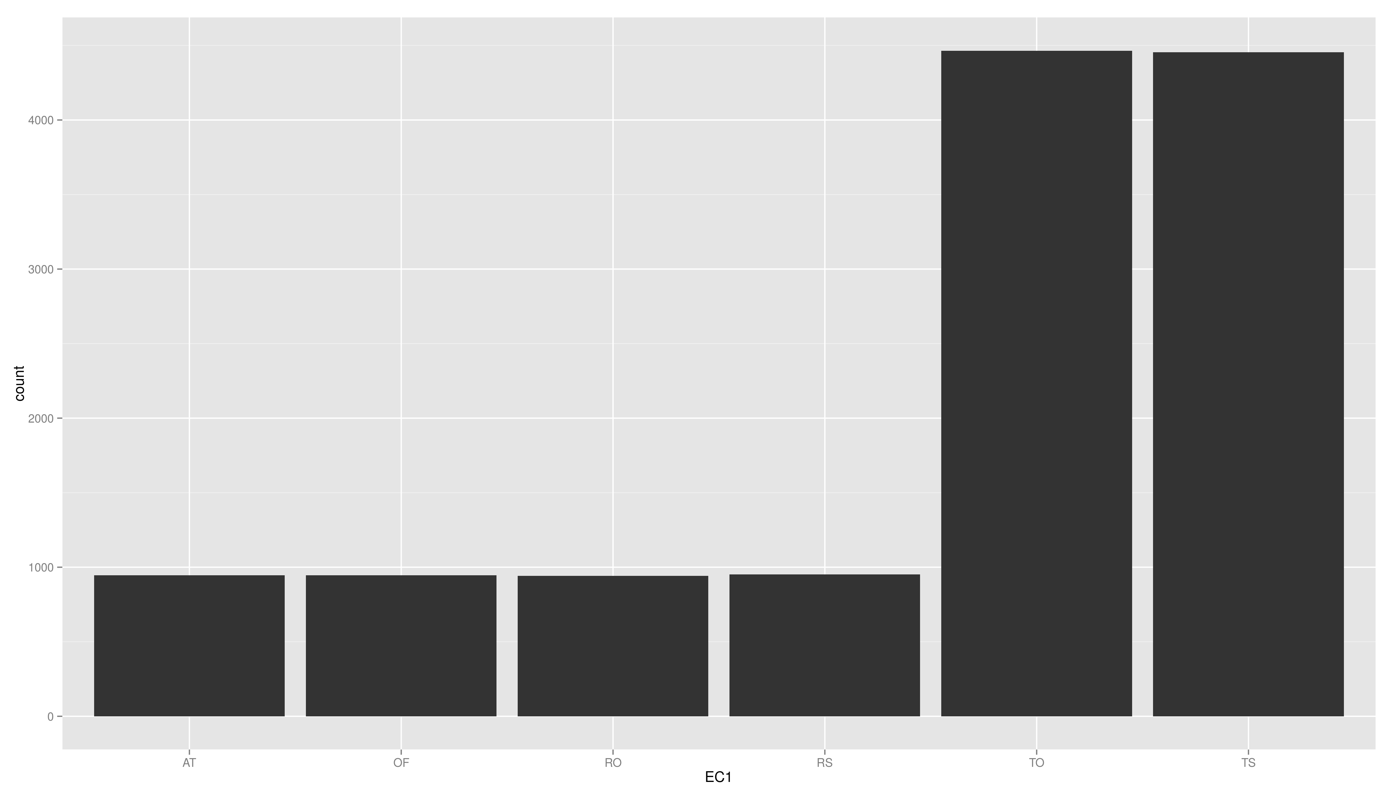
- create a plot using ggplot, map the variable EC1 to x and use geom_bar()
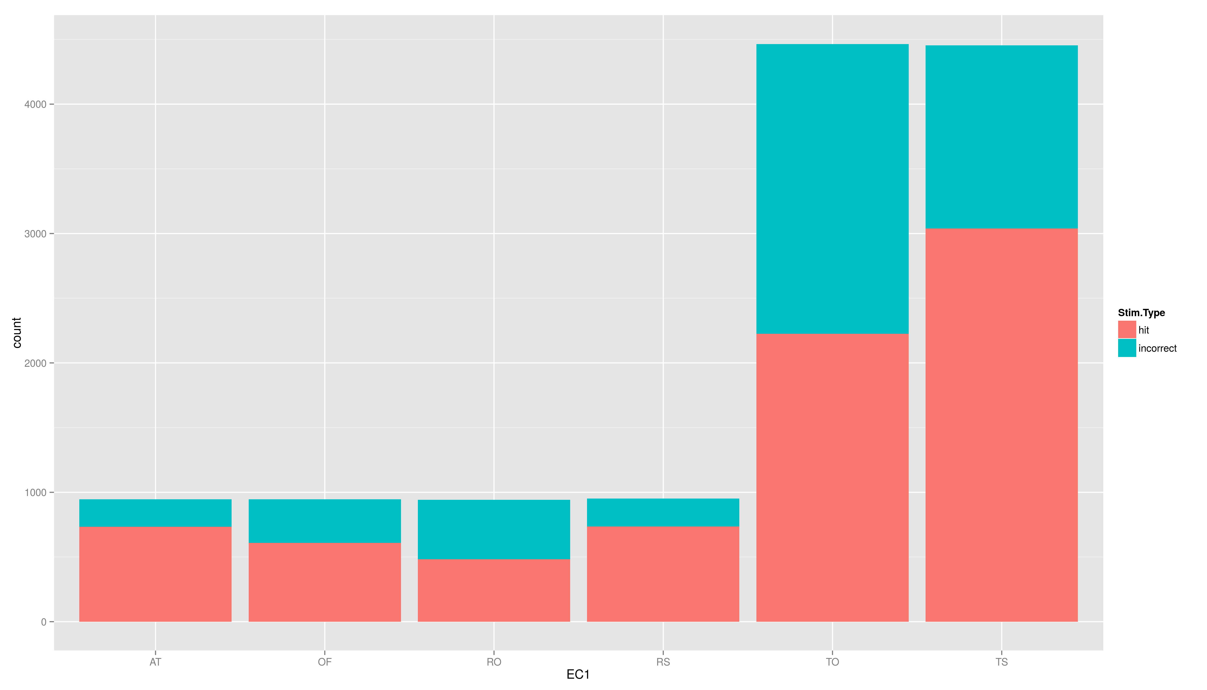
- now to the plot again, but add another aesthetic: fill (colour of the filling); map fill to Stim.Type
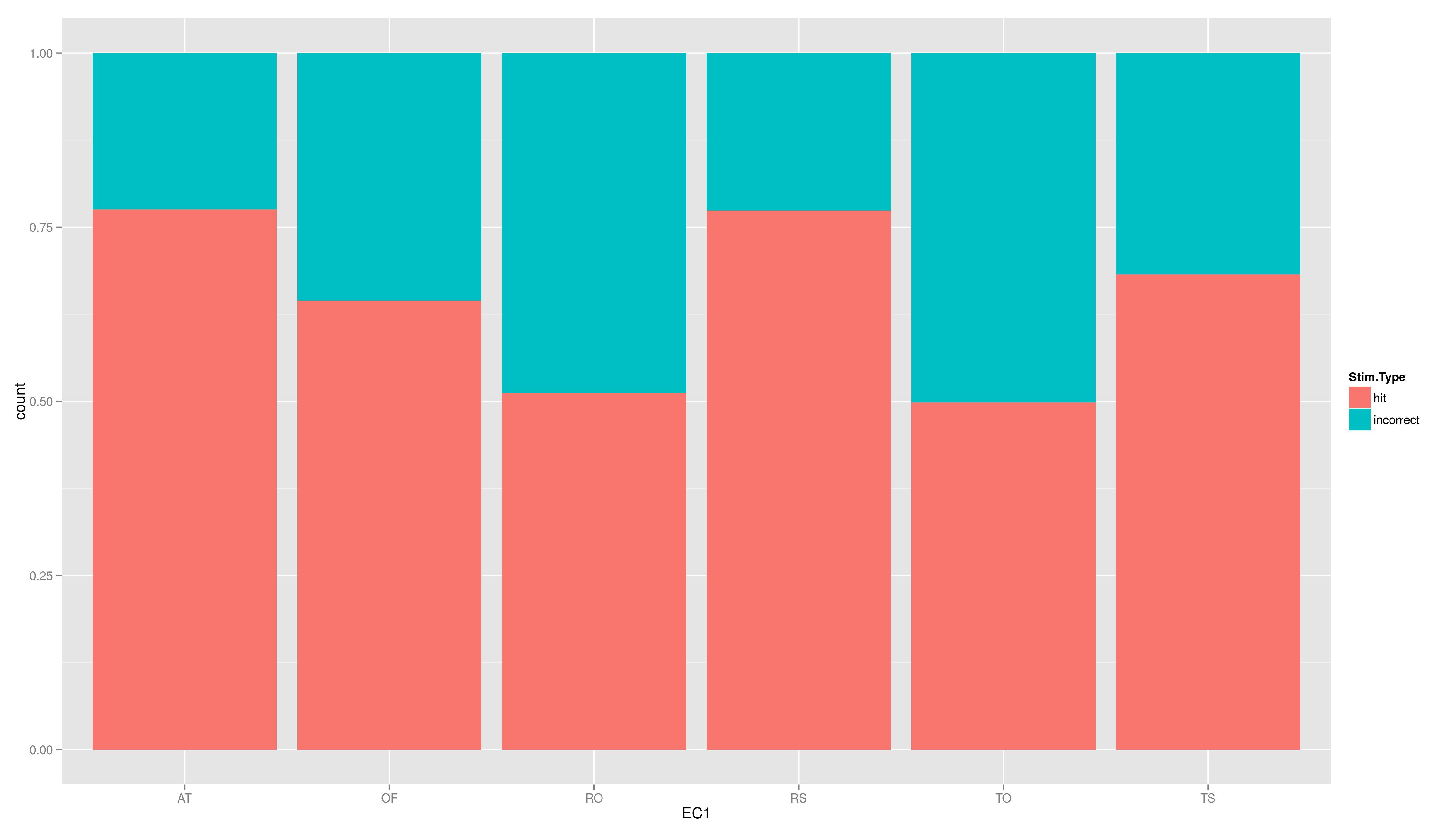
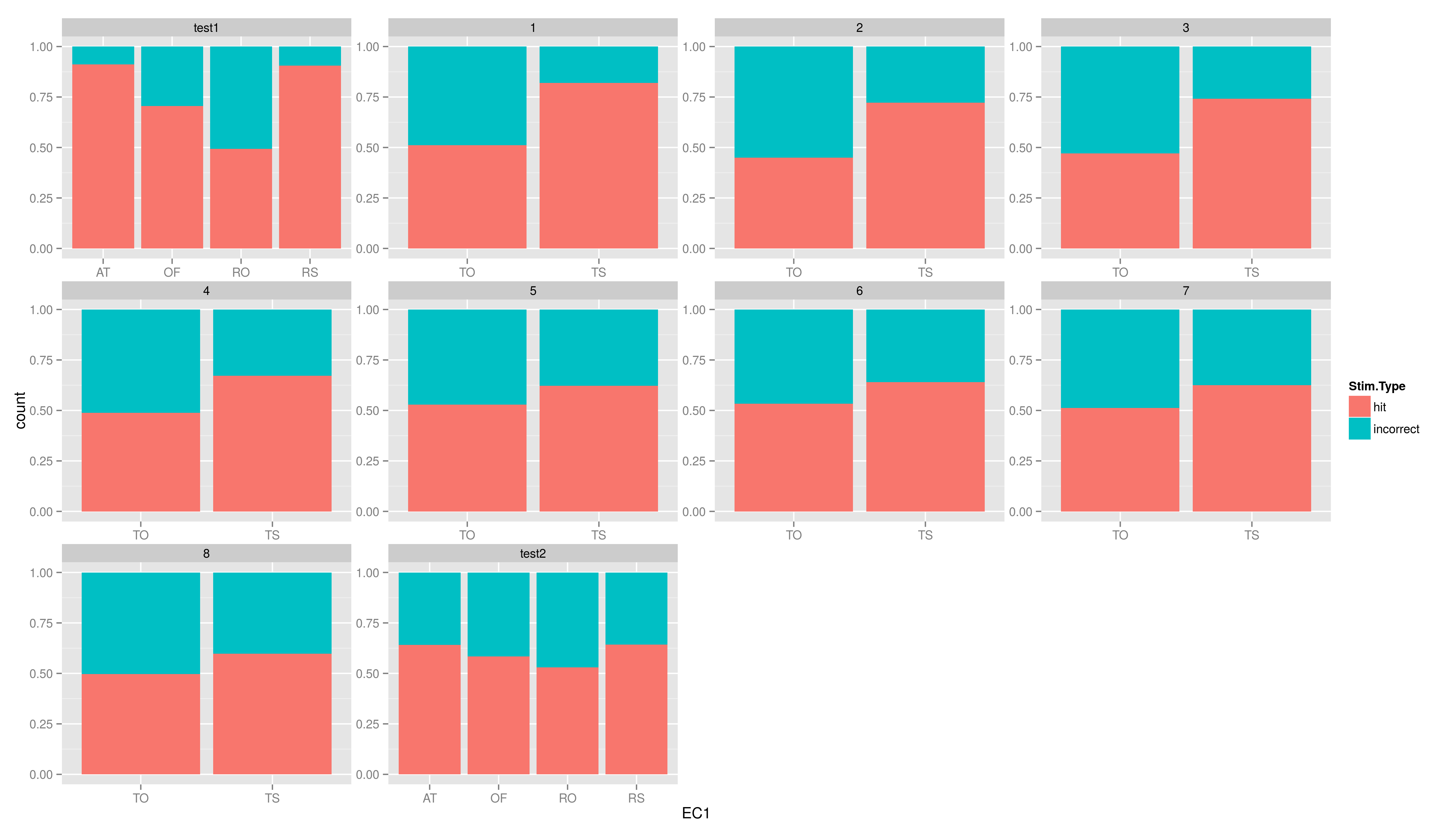
- add the position argument to geom_bar(), set it to "fill"
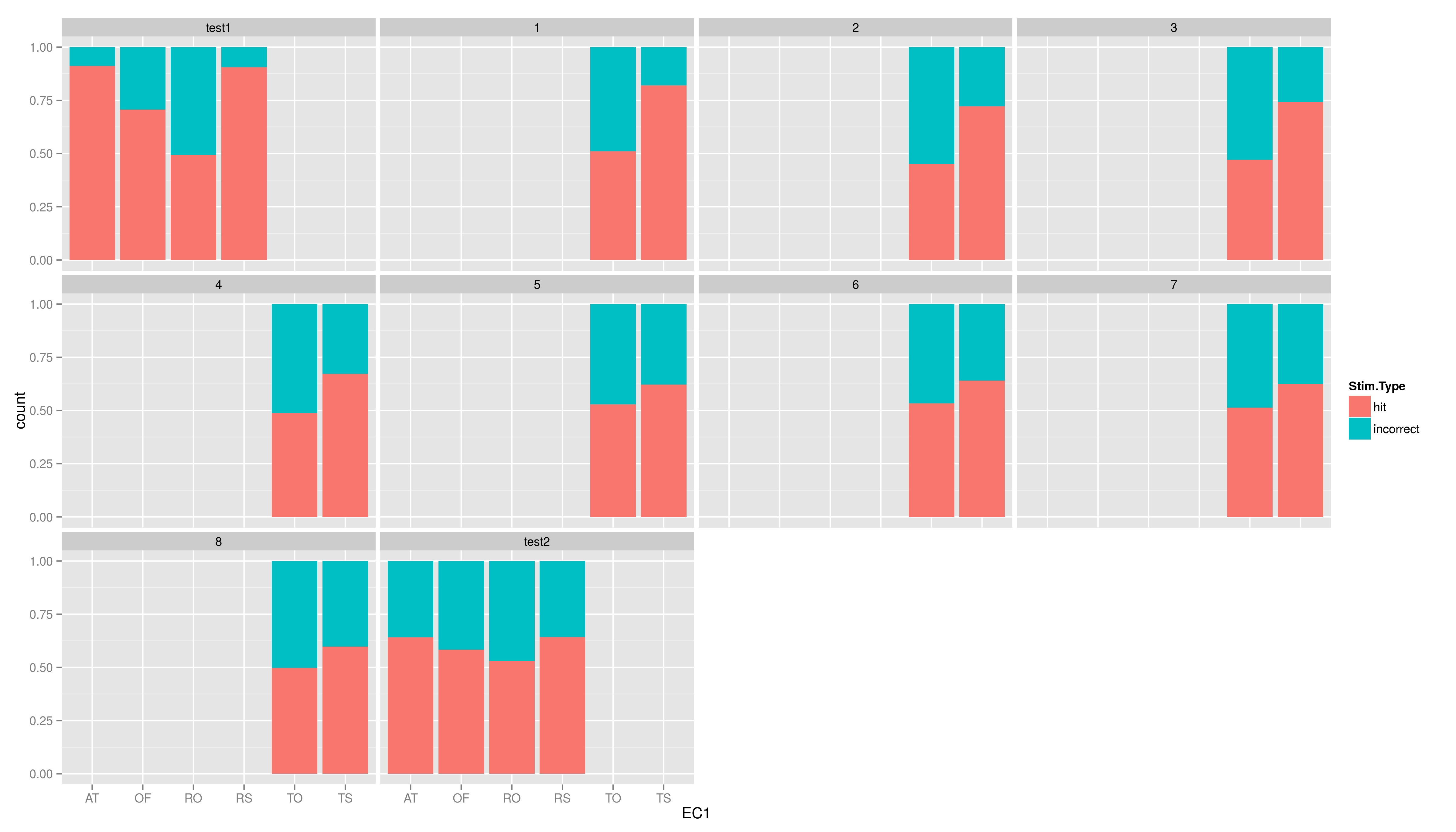
- now add facet_wrap(~testid) to show the same graph per time
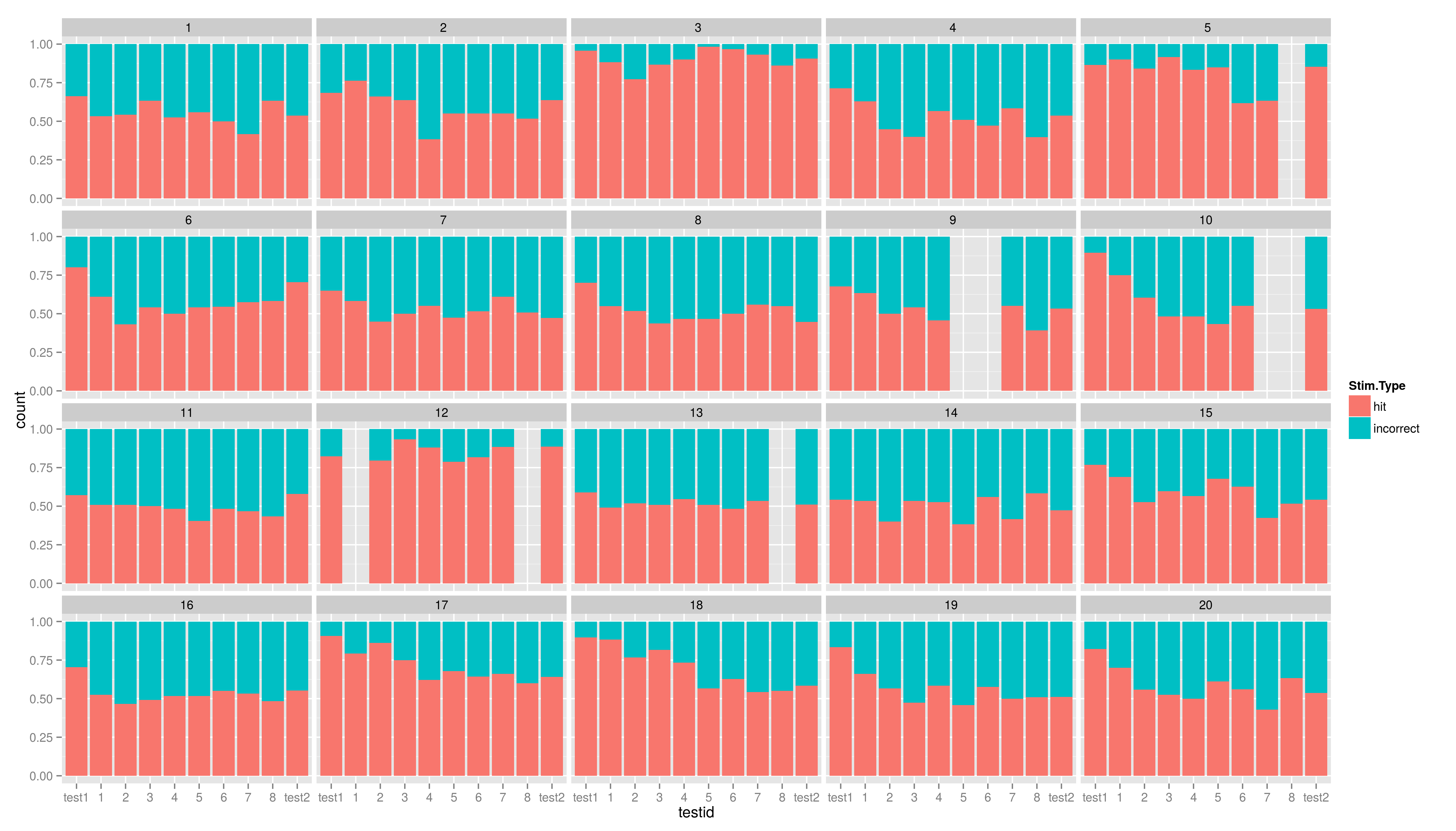
- make a graph facetted per child showing stacked hit/incorrect bars with time on the x axis
solutions
- create a plot using ggplot, map the variable EC1 to x and use geom_bar()
- now to the plot again, but add another aesthetic: fill (colour of the filling); map fill to Stim.Type
- add the position argument to geom_bar(), set it to "fill"
- now add facet_wrap(~testid) to show the same graph per time
- now add facet_wrap(~testid) to show the same graph per time
- make a graph facetted per child showing stacked hit/incorrect bars with time on the x axis
Scales
What if we want to change the colours?
- this leads to another important type of component not yet mentioned
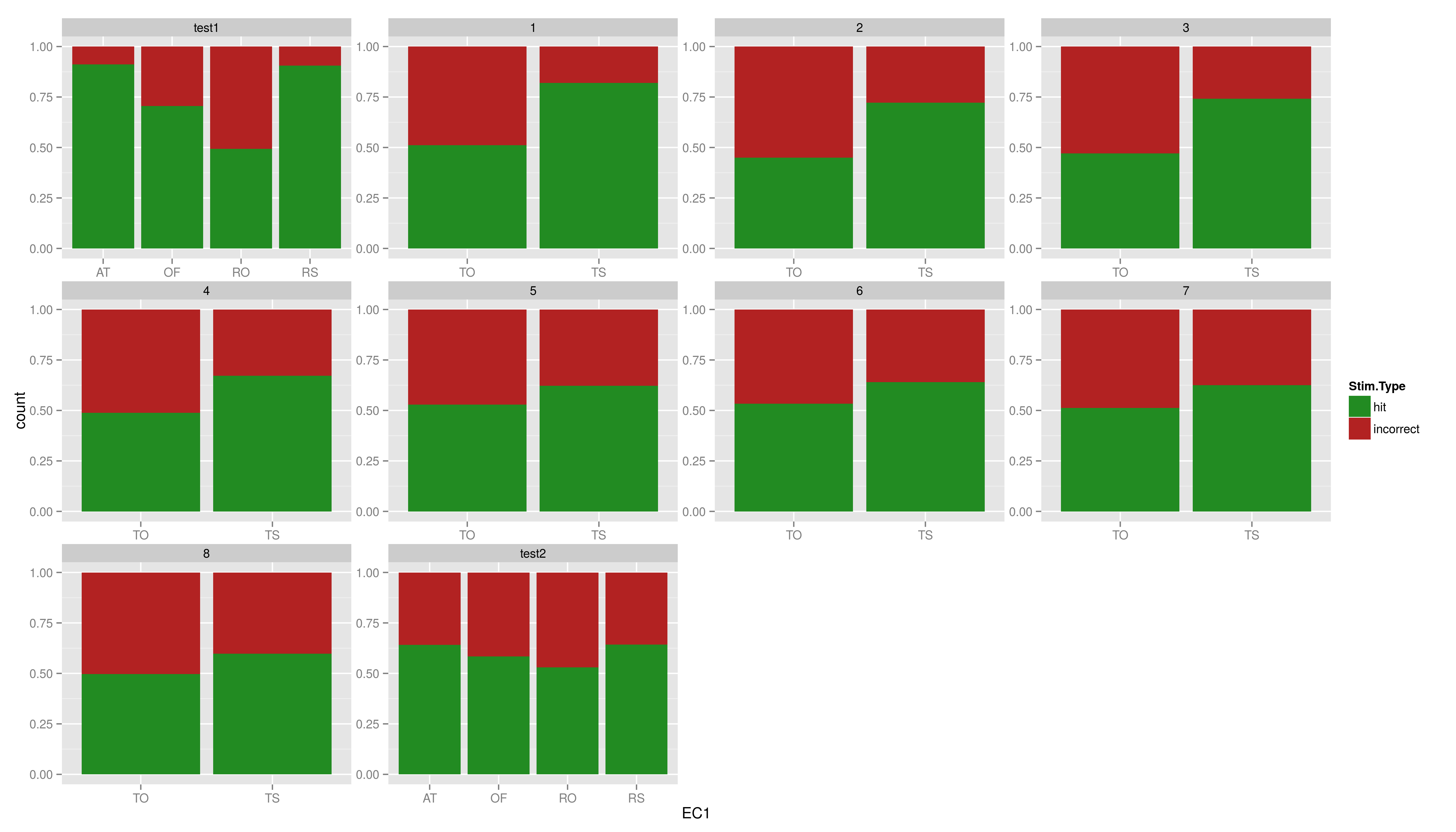
- if you map a variable to a aesthetic is these done in a default way, in this case some reddish colour is mapped to hit while light blue is mapped to incorrect; in addition a discrete range of colours is automatically used
- these rules of mapping are called scales
- different type of scales exists for the axes, colours, shapes etc, some of them exists in discrete and continuous versions, some in just one of them (in general one can say, everytime there can be a legend there is a scale)
- the name convention: scale_aesthetic_specification. for example scale_x_discrete for customizing a discrete x axis (e.g. in barplots)
Changing a Scale
- to change our discrete colour scale for the filling we type \footnotesize
There are other ways to customize a discrete colour/fill scales
- scale_colour_grey()
- scale_colour_hue()
- scale_colour_brewer()
   1 > ggplot(data,aes(x=EC1,fill=Stim.Type)) +
   2 +     geom_bar(position = "fill") +
   3 +     facet_wrap(~testid,scales = "free") +
   4 +         scale_fill_grey()
   5 > ggplot(data,aes(x=EC1,fill=Stim.Type)) +
   6 +     geom_bar(position = "fill") +
   7 +     facet_wrap(~testid,scales = "free") +
   8 +         scale_fill_hue(h=c(180,360))
   9 > ggplot(data,aes(x=EC1,fill=Stim.Type)) +
  10 +     geom_bar(position = "fill") +
  11 +     facet_wrap(~testid,scales = "free") +
  12 +     scale_fill_brewer(type = "div",palette = 2)
Continuous Scales
Not only colour scales are modifiable
- here scale_aesthetic_specification becomes scale_x_continuous() or scale_y_continuous()
- to transform a axis we can use the trans arg
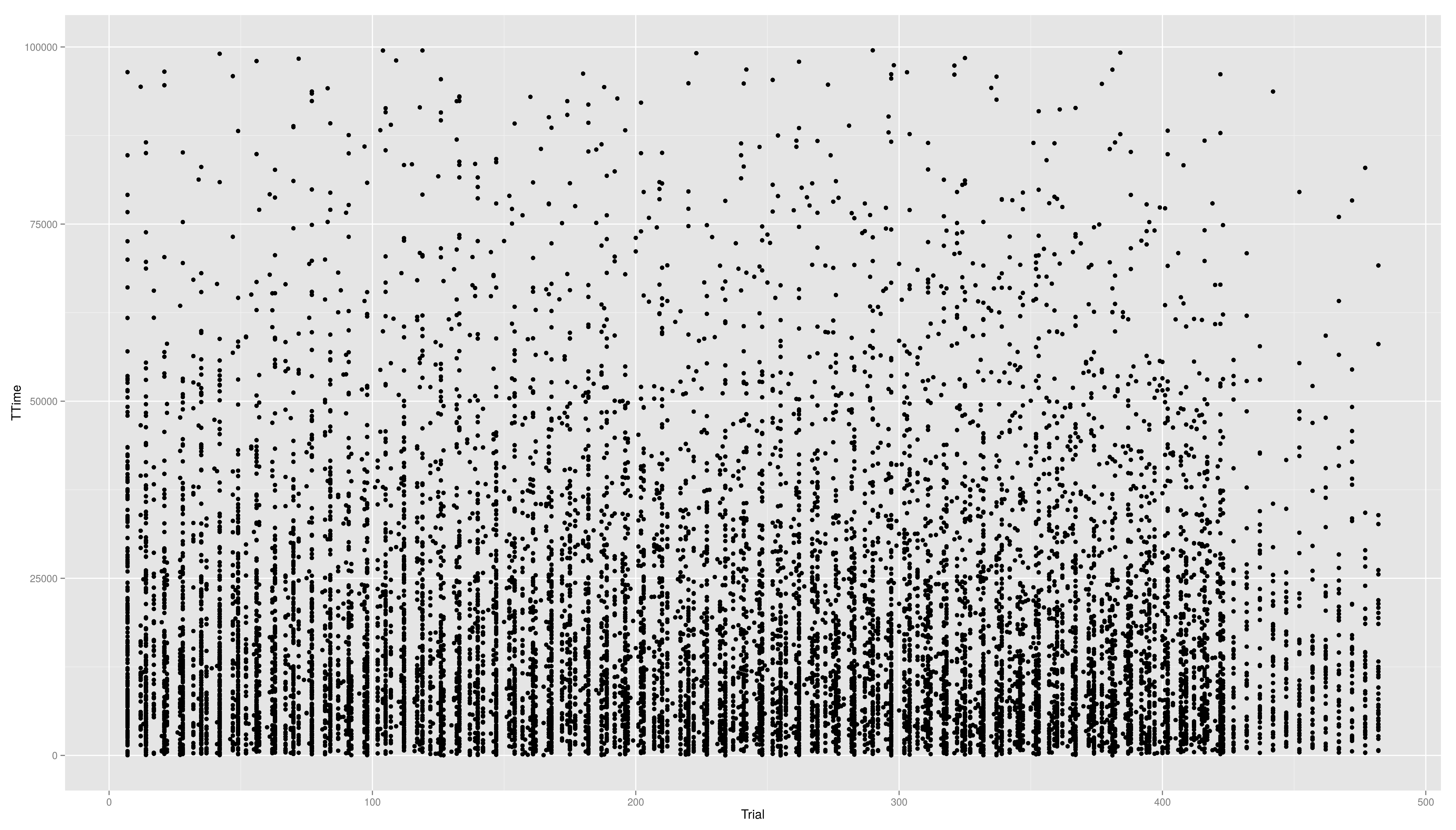
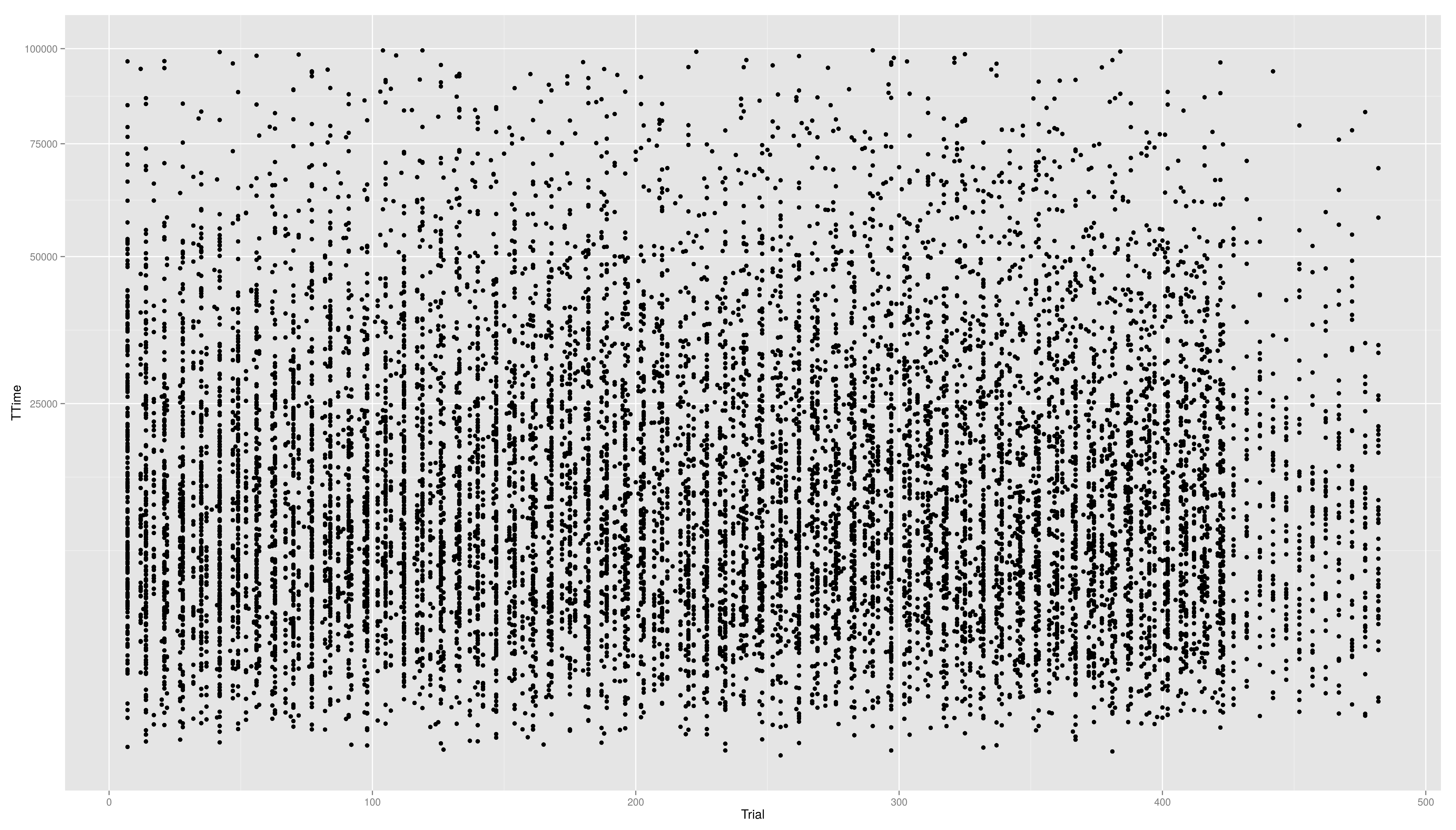
- we now create a scatter plot with Trial on the x-axis and TTime on the y-axis
- the respective geom is geom_point()
- if we look at the distribution of the y values we see that they are right skewed
- to face the skewness we can transform the y-axis maybe with a square root function
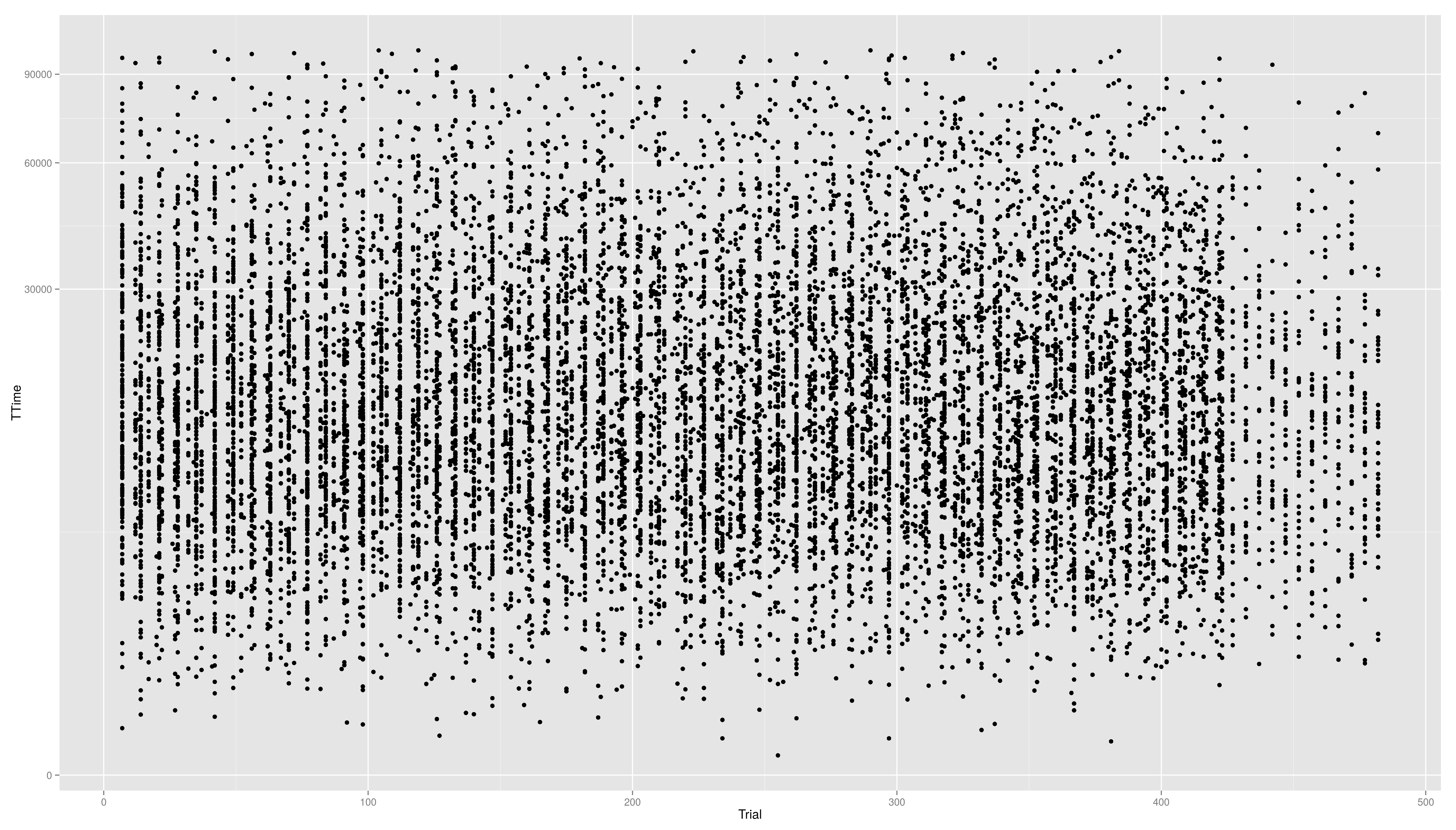
- still a little skewed...
- ... so maybe we should try
latex error! exitcode was 1 (signal 0), transscript follows:

This is pdfTeX, Version 3.14159265-2.6-1.40.19 (TeX Live 2019/dev/Debian) (preloaded format=latex)
entering extended mode
(./latex_6f039602e893e250af4d36788a338962115664ab_p.tex
LaTeX2e <2018-12-01>
(/usr/share/texlive/texmf-dist/tex/latex/base/article.cls
Document Class: article 2018/09/03 v1.4i Standard LaTeX document class
(/usr/share/texlive/texmf-dist/tex/latex/base/size12.clo))
(/usr/share/texlive/texmf-dist/tex/latex/amsfonts/amssymb.sty
(/usr/share/texlive/texmf-dist/tex/latex/amsfonts/amsfonts.sty))
(/usr/share/texlive/texmf-dist/tex/latex/amsmath/amsmath.sty
For additional information on amsmath, use the `?' option.
(/usr/share/texlive/texmf-dist/tex/latex/amsmath/amstext.sty
(/usr/share/texlive/texmf-dist/tex/latex/amsmath/amsgen.sty))
(/usr/share/texlive/texmf-dist/tex/latex/amsmath/amsbsy.sty)
(/usr/share/texlive/texmf-dist/tex/latex/amsmath/amsopn.sty))
(/usr/share/texlive/texmf-dist/tex/latex/amscls/amsthm.sty)
(/usr/share/texlive/texmf-dist/tex/latex/base/inputenc.sty)
No file latex_6f039602e893e250af4d36788a338962115664ab_p.aux.
! Missing $ inserted.
<inserted text>
                $
l.10 x^
       {1/3}
(/usr/share/texlive/texmf-dist/tex/latex/amsfonts/umsa.fd)
(/usr/share/texlive/texmf-dist/tex/latex/amsfonts/umsb.fd)
! Missing $ inserted.
<inserted text>
                $
l.11 \end{document}

[1] (./latex_6f039602e893e250af4d36788a338962115664ab_p.aux) )
(see the transcript file for additional information)
Output written on latex_6f039602e893e250af4d36788a338962115664ab_p.dvi (1 page,
 296 bytes).
Transcript written on latex_6f039602e893e250af4d36788a338962115664ab_p.log.
- we first have to write a new transformation\small
For standard transformation there is a short cut:
- scale_x_log10()
- scale_x_reverse()
- scale_x_sqrt()
Other transformation available: \small
Other Scales
- colour scales have also a continuous version (we have seen it in the first bar plot)
- scale_colour_gradient()
- scale_colour_gradient2()
- scale_colour_gradientn()
- scale_linetype_continuous() and scale_linetype_discrete()
- scale_shape_continuous() and scale_shape_discrete()
- scale_size_continuous() and scale_size_discrete()
- scale_x_date()
- scale_discrete()
Exercises
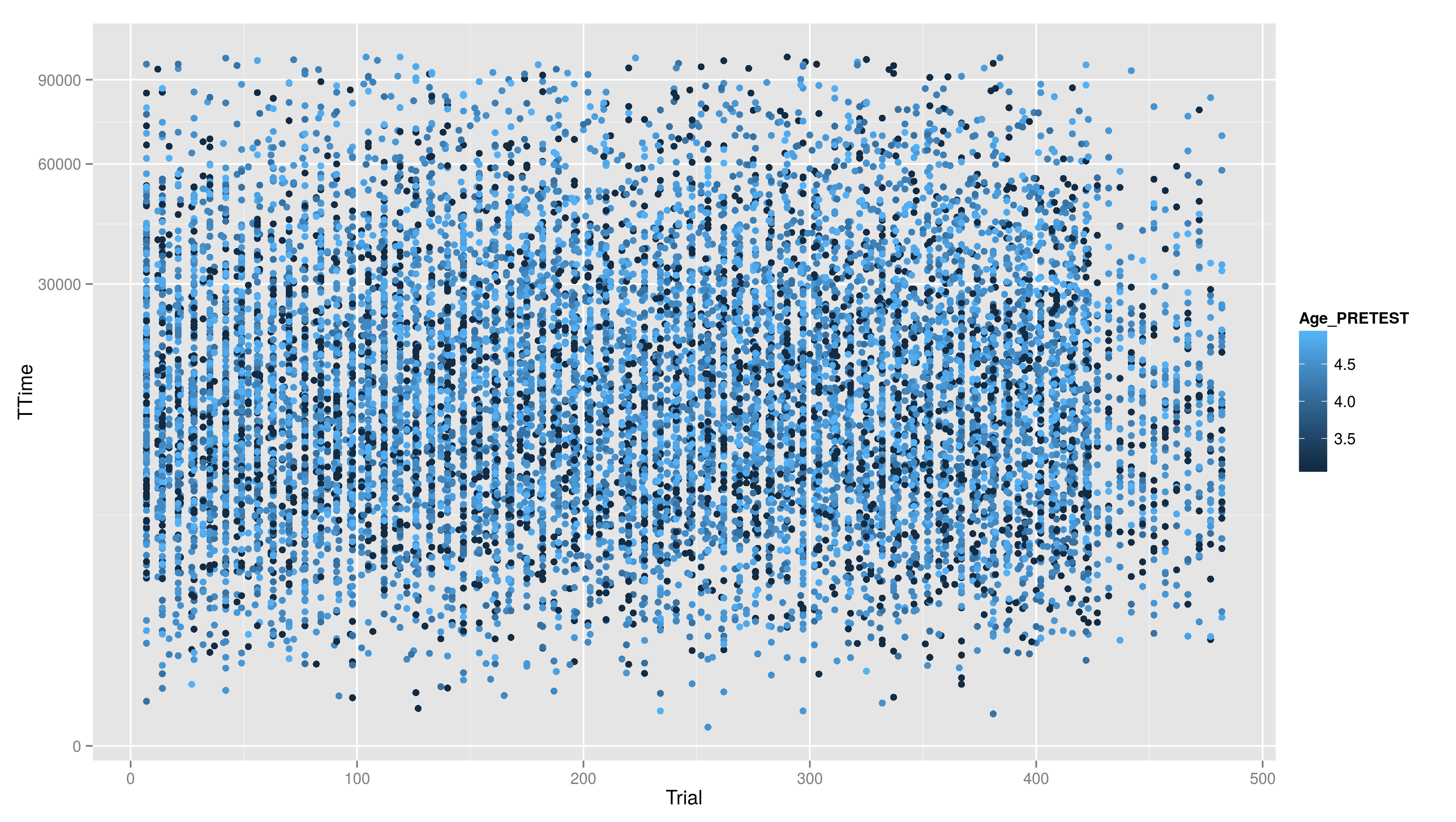
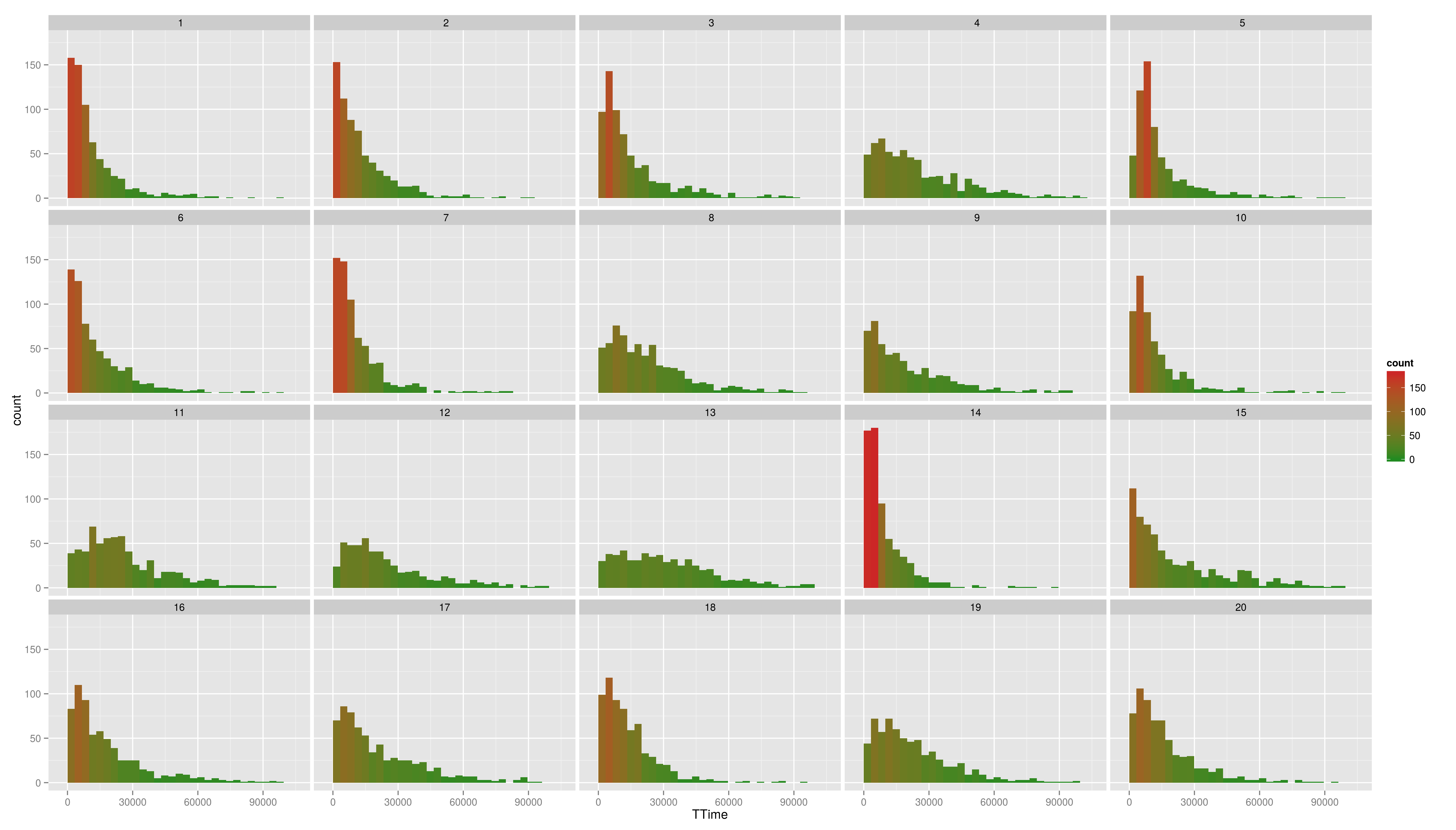
* Create a scatter plot with Trial on the x-axis and TTime on the y-axis. Map colour to to age column. Looking at the pattern in the graph, is there relation between age and reaction time? * Make a plot which has a facet for each child containing the histogram of TTime, map fill to ..count.. (fill=..count.. inside aes()) * then add scale_fill_gradient() and set its arguments low and high to, say green and red resp. (or make your own choice) * do the same but now do the facetting by testid (and second per Stim.Type level). What can you conclude from these graphs?
Solutions
- Create a scatter plot with Trial on the x-axis and TTime on the y-axis. Map colour to to age column. Looking at the pattern in the graph, is there relation between age and reaction time?
- Make a plot which has a facet for each child containing the histogram of TTime, map fill to ..count.. (fill=..count.. inside aes())
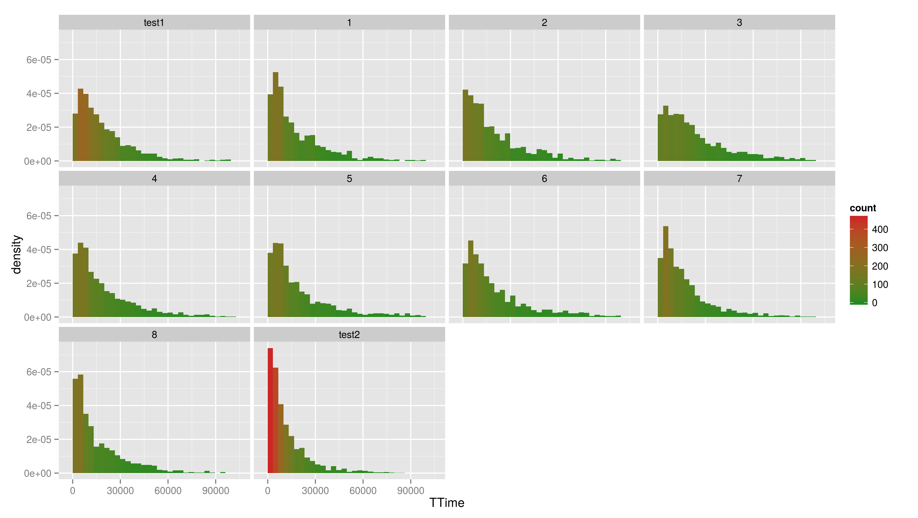
- then add scale_fill_gradient() and set its arguments low and high to, say green and red resp. (or make your own choice)
- do the same but now do the facetting by testid (and second per Stim.Type level). What can you conclude from these graphs?
- do the same but now do the facetting by testid (and second per Stim.Type level). What can you conclude from these graphs?
Hadleyverse
- stringr - easy string manipulation
- lubridate - easy date time manipulation
- reshape2, tidyr - data manipulation, melting
- devtools, testthat - package developement
- etc


